Understanding colour
Why are objects different colours? Light is made up of three primary colours red, yellow and blue. The reflection of the dominant colour being bounced back from the surface gives an object its colour.
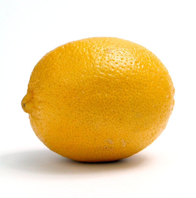
Take the lemon for example, the atoms of the lemon absorb most of the red and blue rays while reflecting the yellow rays giving the lemon its yellow hue.
 Complimentary colour
Hue = discernible colour
Look at the dominant colour of any given object and it will be reflecting a variation of red, yellow and blue rays. Not all of the atoms of the lemon absorb the red and blue rays and so effect the hue of the lemon i.e. some lemons are on the greener side having more blue rays reflected and some lemons are on the orange side having more red rays reflected back to us.
Chroma = intensity of colour
A lemon is not the colour of the highest chroma yellow on your palette. The intensity of the yellow pigment needs to be desaturated using the compliment of red and blue to get the correct yellow hue.
Value = tonal range
Each colour has its own tonal value from 1 to 9, white = 1 and black = 9 value. A yellow is say a 3 value, red and blue around a 7 value. The darker values of red and blue would be added to the yellow to illustrate the darker tones of the lemon as it turns away from the light.
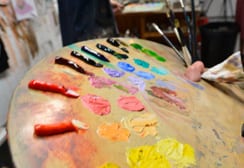
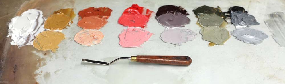
Organising the palette
The palette is organise by dividing it up into the warmer colours on the left hand side and the cooler colours on the right hand side of the palette. Each colour is broken down into 3 values by adding white for the middle and light tones which will help to mix the lighter tones of the face more accurately. For example, adding a highly saturated dark pigment like pthalo green to a lighter flesh colour would completely overpower it but by adding a lighter value of pthalo green from our value strip would tint the colour with more accuracy .
Colour Wheel
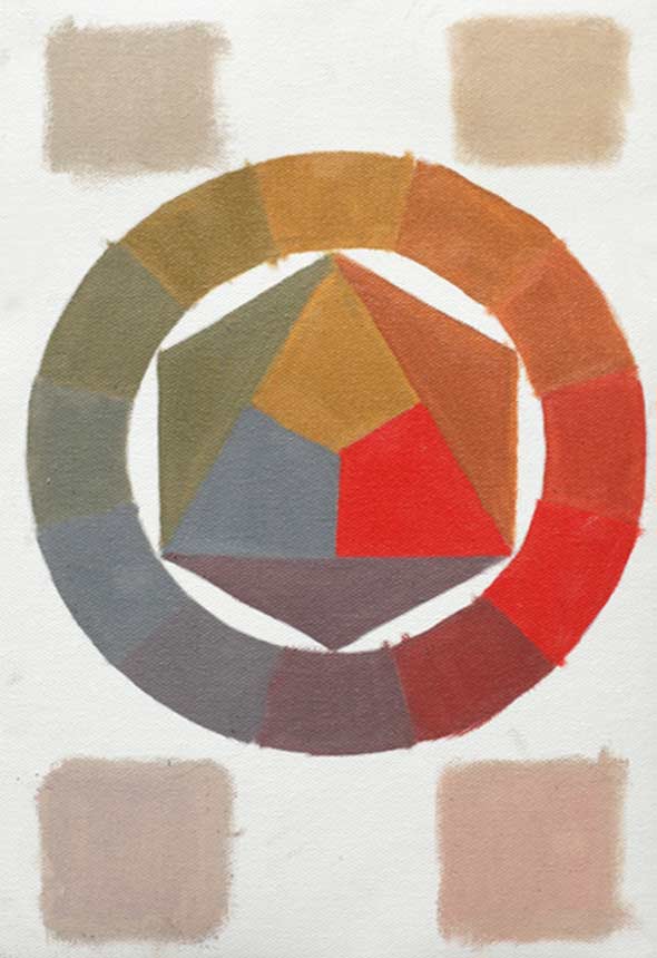
This is a useful exercise to help students understand the potential of using black as a blue pigment. Most black pigments are a dark low chroma blue, when a mid black is placed alongside the other colours it does appear blue. Students also learn how the black works when mixing it with the cadmium red and yellow ochre to achieve secondary and tertiary hues.
The limited palette has an harmonious colour range as all the colours are mixed from low saturated primary colours. Most beginners invest in high chroma colours which look nice on their own but when used to create the illusion of form are difficult to control and can result in an over saturated mess. This method promotes a disciplined approach to mixing colour as it challenges the student into getting the most out of a small range of low chroma colour.
The wheel can be used as a complimentary colour reference as all the colours on the opposite side of the wheel are complimentary to one another.
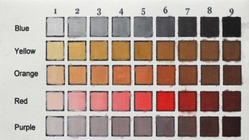
Value Chart
The value Chart helps the student to understand the tonal value of each colour and how to add complimentary colours to extend the value and make it appear deeper in colour.
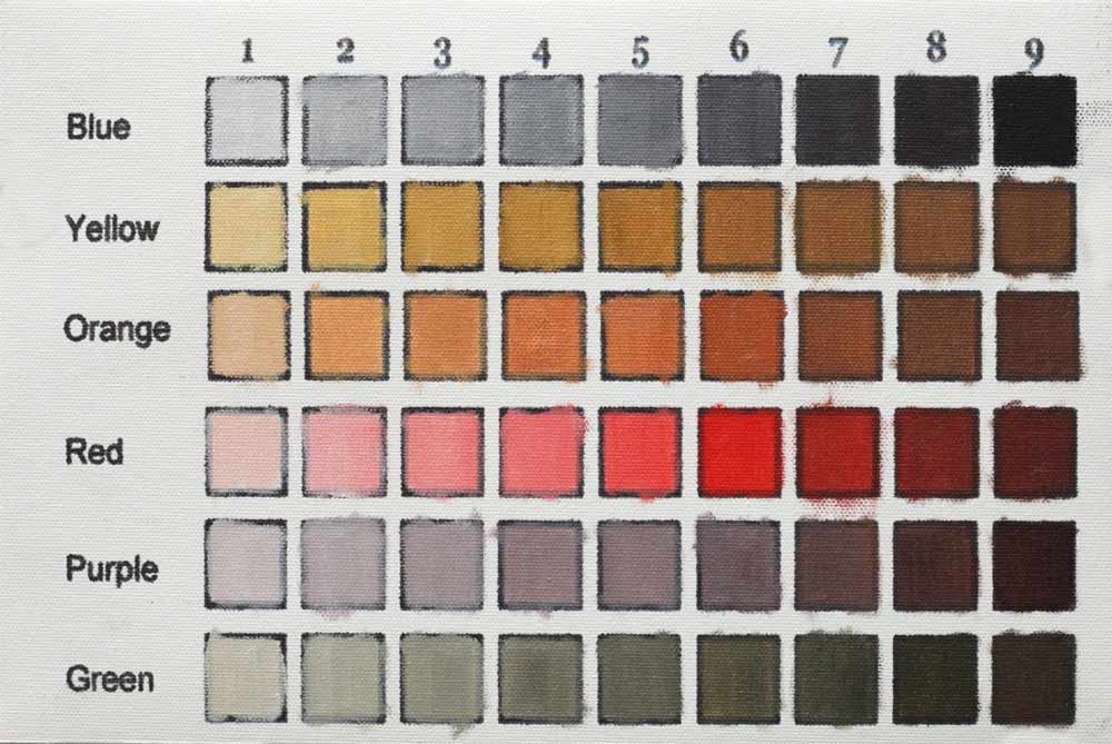
Each colour has its own tonal value from 1 to 9,
- White = 1 value
- Blue Black = 9 value
- Yellow ochre = 3 value
- Orange = 5 value
- Cadmium Red = 6 Value
- Purple = 7 Value
- Green = 6 Value
Value Chart
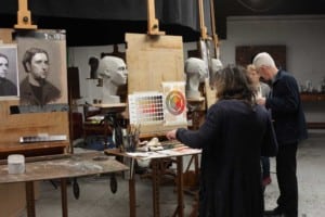
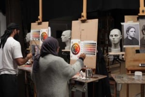
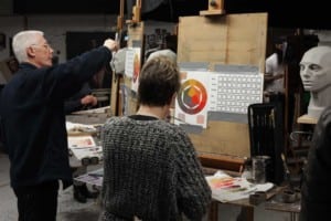
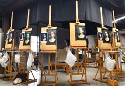
Below you can see the students working on this weeks lesson. We were 3 people down this week for various reasons which is a shame as its one of the most important lessons regarding colour theory.