Aim of this Project
First Part going over the basics. Teaching students how to organise the palette, mix secondary and tertiary colours, the tonal value of each colour and mixing complimentary colour.
Second Part is to put the theory into practice, paint a portrait observing the variation of colour in the skin tones, hair, shirt and background.
First Part
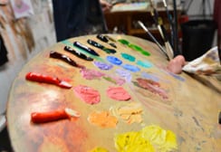
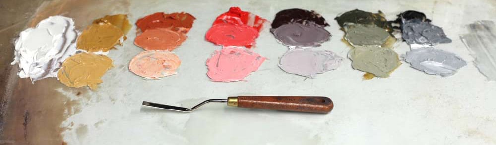
Limited Palette Colours
The Limited Palette is made up of the three primary colours Red, Yellow and Blue plus White. All the secondary colours on the palette are mixed from the primary colours. The palette is based on the Zorn Palette consisting of Yellow Ochre, Cadmium Red, Ivory Black (blue) and Titanium White. The limited palette is a useful training tool, teaching students how to mix paints and get the most out of the limited colour range.
Organising the palette
The palette is organise by dividing it up into the warmer colours on the left hand side and the cooler colours on the right hand side of the palette. Each colour is broken down into 3 values by adding white for the middle and light tones which will help to mix the lighter tones of the face more accurately. For example, adding a highly saturated dark pigment like pthalo green to a lighter flesh colour would completely overpower it but by adding a lighter value of pthalo green from our value strip would tint the colour with more accuracy .
Colour Wheel
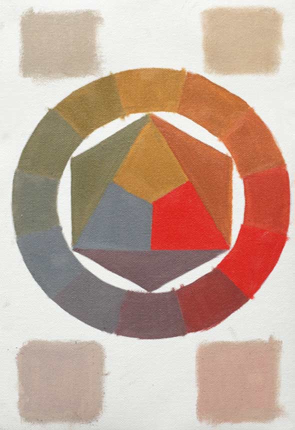
This is a useful exercise to help students understand the potential of using black as a blue pigment. Most black pigments are a dark low chroma blue, when a mid black is placed alongside the other colours it does appear blue. Students also learn how the black works when mixing it with the cadmium red and yellow ochre to achieve secondary and tertiary hues.
The limited palette has an harmonious colour range as all the colours are mixed from low saturated primary colours. Most beginners invest in high chroma colours which look nice on their own but when used to create the illusion of form are difficult to control and can result in an over saturated mess. This method promotes a disciplined approach to mixing colour as it challenges the student into getting the most out of a small range of low chroma colour.
The wheel can be used as a complimentary colour reference as all the colours on the opposite side of the wheel are complimentary colours.
Value Chart
The value Chart helps the student to understand the tonal value of each colour and how to add complimentary colours to extend the value and make it appear deeper in colour.
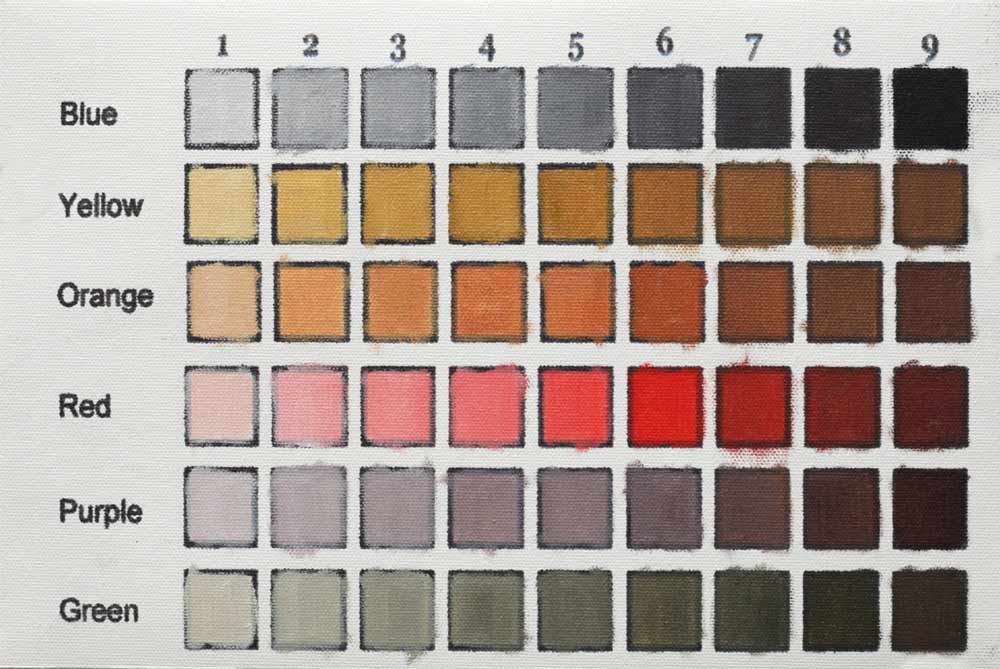
Each colour has its own tonal value from 1 to 9,
- White = 1 value
- Blue Black = 9 value
- Yellow ochre = 3 value
- Orange = 5 value
- Cadmium Red = 6 Value
- Purple = 7 Value
- Green = 6 Value
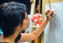
Second Part
Limited Palette
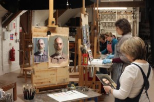
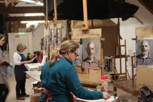
The second part is to put the theory into practice, to paint a portrait observing the variation of colour for the skin tones, hair, cloths and background. The subject was chosen for this project because of the variety of colour in his face, shadows and beard.
When mixing the flesh colours students now have to consider three variables Hue, Chroma and Tonal Value whereas before it was just tonal value the students had to consider.


Homework
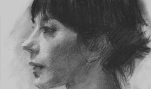
Students were given the same subject but different angle to work on and repeat all the steps in class. Below is the homework by Judith which was a huge leap forward after the first attempt.
-

- Judith
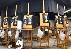
Rendering The Head in Colour
Below students are working on the second part of the project, rendering the head in colour.